Raimbaut d'Orange · section 4
The editorial work
The editorial work
A transcription, however accurate, is not yet an edition. Between the corpus and the published site sits a layer of editorial decisions. The decisions themselves required judgement; their application, as the previous section argued, was made mechanical, so that each one is written down in a rule or a data file rather than scattered across a thousand silent interventions.
From typewriter conventions to typographic ones
A typescript approximates typography with what a typewriter can do, and the transcription initially preserved those approximations literally. A normalization pass then translates them into the real thing, by explicit rules. The concrete cases give the flavor better than any principle:
- Line breaks. The typescript breaks lines where the carriage returned, and the transcription kept those physical breaks. For prose, the normalizer joins each paragraph back into one logical line, removing the soft hyphens of words split at line ends and logging every removal to a review file. Verse is exempt: inside the marked Occitan verse blocks, every line break is the poet's (or the editor's) and none is the typewriter's, so the normalizer does not touch them.
- Dashes. The typewriter has only the hyphen, so my father typed
-where French typography wants an em dash. The rule converts a spaced hyphen to a spaced em dash ( — ), with one refinement that shows why these rules need a human author: not between two capitals, because there the hyphen is usually a real hyphen in a compound name. - Spacing before punctuation. French sets a small space before
;:!?. The typescript uses a full space or none; the normalizer sets a narrow no-break space, the thin, non-breaking variant that keeps the punctuation from wandering to the next line. - Guillemets. Quotations in « » get the same narrow no-break space on the inside of each guillemet.
- Section breaks. Where the typescript stacks
+signs as a divider, the edition sets an asterism (⁂).
None of this is exotic; it is what a compositor would have done in 1981 if the thesis had gone to a printer. The point of listing it is that each rule is deliberate, inspectable in one script, and applied identically to all 586 pages, which is a different epistemic situation from a thousand ad-hoc fixes.
One text, two presentations of fidelity
Normalization raises an obvious objection: the typescript did not say —,
it said -, and an edition that silently improves its source is on a
slope. The edition's answer is architectural rather than apologetic. Every
chanson can be read in two fundamentally different presentations. The
reading views (the web view and the continuous book view) present the
normalized, apparatus-enriched text described in this piece. The facsimile
view presents one screen page per typescript page with nothing normalized at
all: names in full capitals as typed, sigla underlined rather than
italicized, the footnotes worded exactly as printed. A reader who wants to
know what the typescript actually says never has to trust the normalized
view, because the unnormalized one is a click away and the page ids line the
two up exactly.
I realise that the technically obvious way to give readers the unnormalized page would have been to show the actual page itself: the scan, or the PDF, embedded page by page. I did not do that, and the reason is not rational. I wanted to create a facsimile, a typescript page rebuilt in type rather than reproduced in pixels, and this is the one place in the project where the pleasure of the making outranked the argument for the simplest tool. I can defend the result (a rebuilt facsimile is searchable, linkable and legible in ways a page image is not), but that is a defence found after the fact. If this ever grows into a published tool for others, a possibility the last section returns to, page-level views of the scans or the PDF would be part of it.
The figures
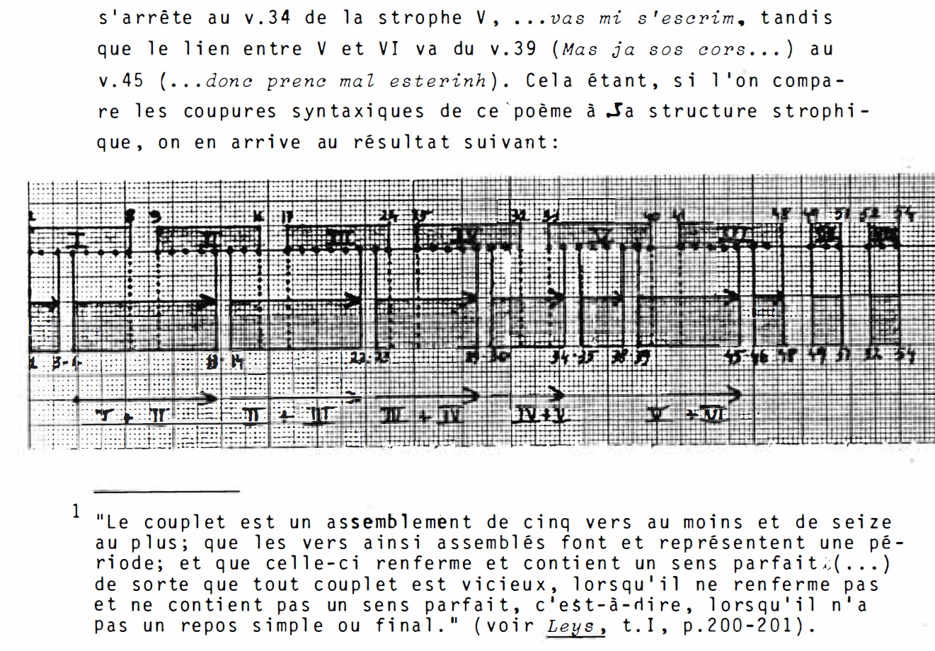
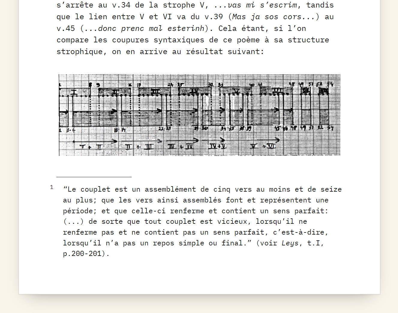
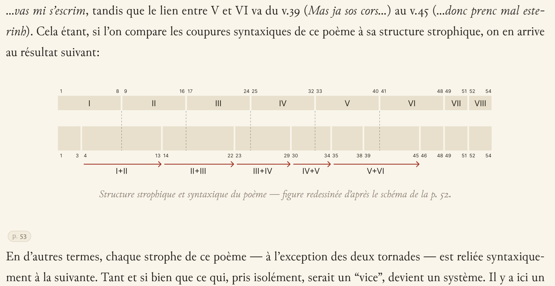
The typescript's figures are where the work most clearly stops being conversion, so they deserve their own exhibit. My father drew his diagrams by hand, on graph paper, and the scans of those drawings are legible the way a photocopied photo of a blackboard is legible. The edition treats them under the same fidelity rule as the text: the facsimile view shows the original drawing, and the reading views show a redesign, labeled as a redesign ("figure redessinée d'après le schéma de la p. 52"), so no reader can mistake my line for his.
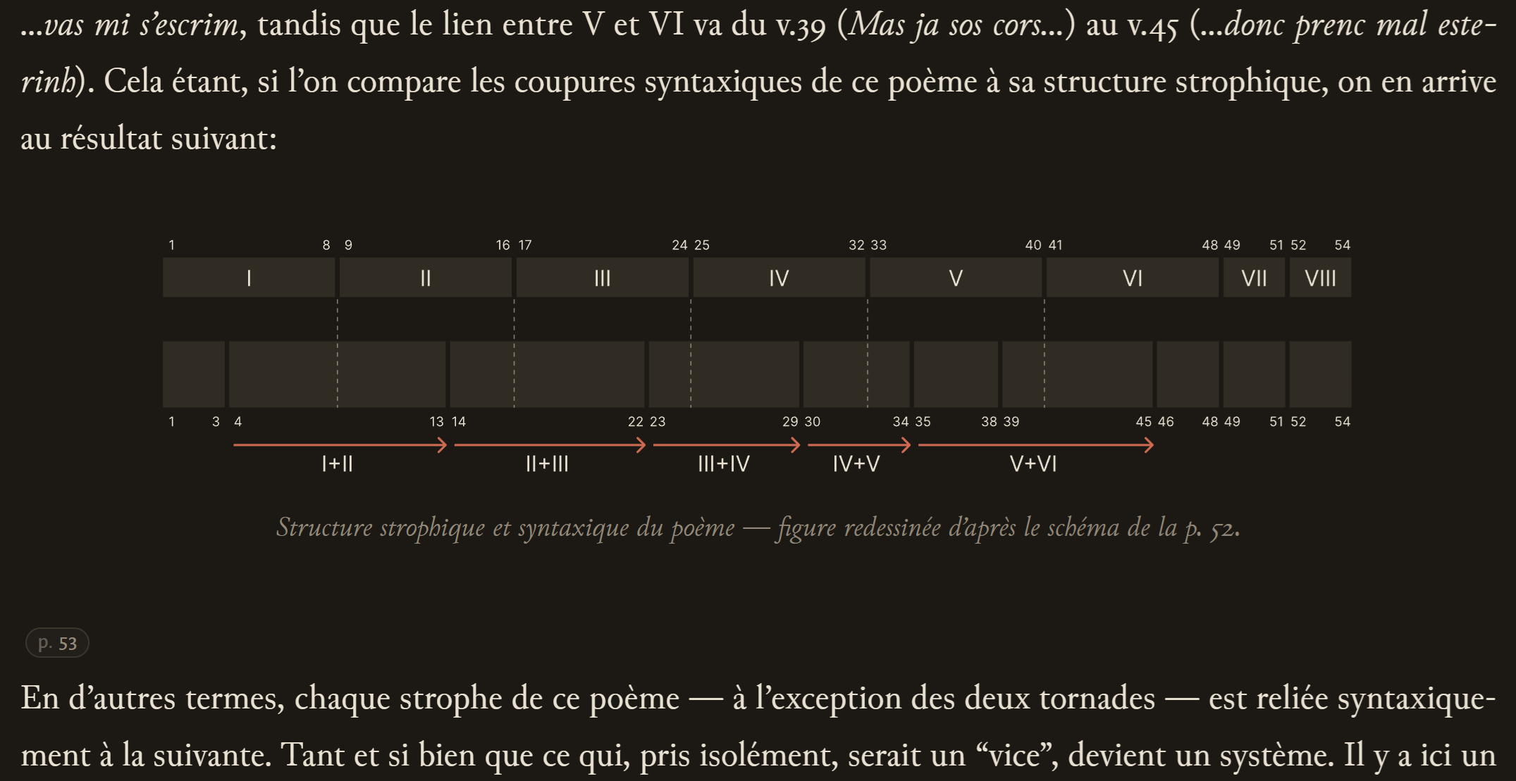
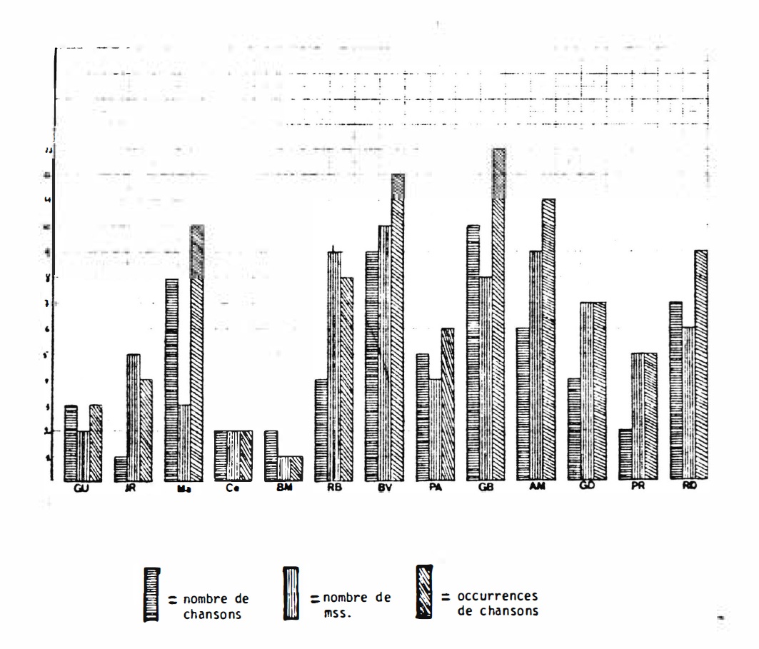
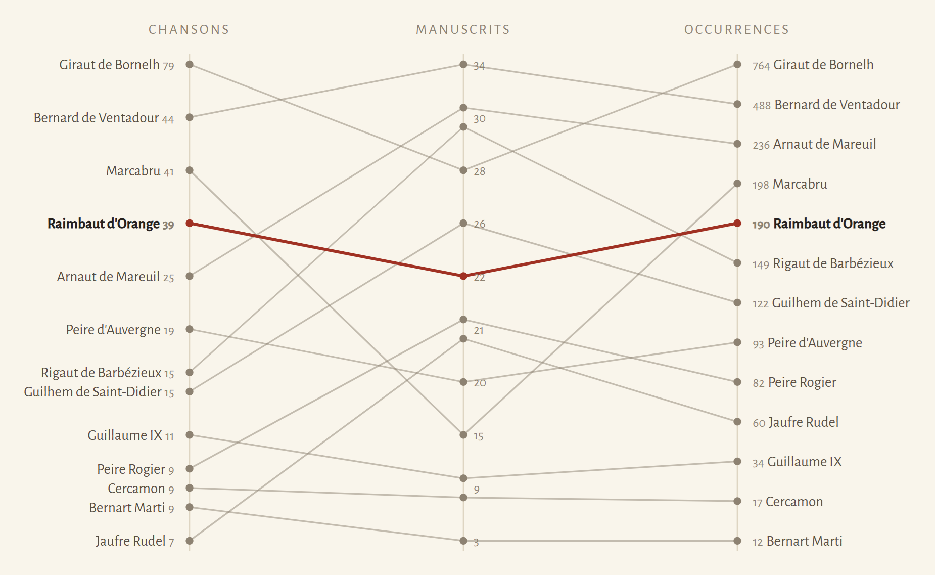
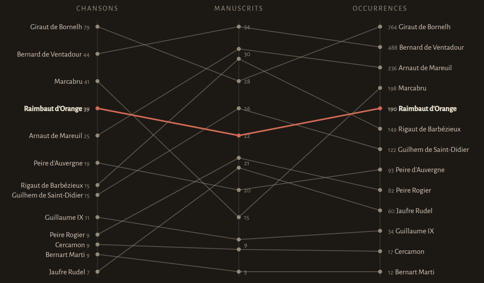
Two examples. In Chanson II, a diagram maps the poem's syntactic breaks against its strophic structure, showing that nearly every strophe is syntactically chained to the next. I redrew it in Figma, exported it as SVG, and wired it into the page so that it recolours itself with the site's light and dark themes. In the introduction, a grouped bar chart compares thirteen troubadours on three factors: surviving chansons, manuscripts, occurrences. For the reading views I replaced it with a slopegraph, one line per troubadour across three ranked axes, because the figure's whole argument is correlation, and in a slopegraph correlation is visible: parallel lines mean the factors agree, and the divergences the text singles out (Jaufre Rudel, with few chansons in many manuscripts, and Marcabru, the inverse) appear as the crossings they are. That figure is generated at build time from the thesis's own table, transcribed into the build code; ties share a rank, as they do in my father's own rankings, and the tied points are spaced and ordered so the lines stay readable.
None of this involved a model at any point. Choosing a slopegraph, deciding that ties should share a rank, nudging tied labels apart, minimizing the line crossings: this is ordinary data-visualization judgement, the same kind of expert work as the information architecture described next, applied at the scale of a single figure. I dwell on it because "AI converted the thesis" is precisely the sentence this piece exists to complicate, and the figures are the cleanest counterexample: the data is my father's, the redesign is mine, and the facsimile keeps his original two clicks away.
site/lib/figures.js; raimbaut.yusupov.cloud/introduction/.The footnotes
The thesis has 1,257 footnotes, and they were the hardest apparatus problem. The typescript numbers its notes per page, starting over at 1 on each page; notes sometimes overflow to the foot of the following page; and the notes lean heavily on positional shorthand, ibid., op. cit., ouv. cité, which works on paper because often (but not always!) the previous note is physically adjacent.
Digitally, all three properties break. Pagination disappears in a reflowing web page, so per-page numbering becomes meaningless; the pipeline therefore namespaces every note by its page id and renumbers for display, while the assembly step reunites the overflowed notes with their beginnings. The positional shorthand is subtler. On the website a footnote is typically encountered alone, in a hovercard or beside the paragraph that cites it, so "ibid." points at nothing the reader can see. For the reading views only, the pipeline rewrites such notes to be self-contained, expanding ibid. into a short title of the actual work, on the basis of the reference resolution described below. The facsimile keeps every note exactly as my father worded it. Fidelity is not averaged between the two needs; each view serves one of them completely.
The sigla
The thesis abbreviates its most-used sources with sigla, and defines them where they first occur, inline, in phrases of the form "(ci-après SW)" — "hereafter SW." There are 24 of them. A script harvests these definitions, ties each siglum to its bibliography entry, and records every place each one is used, which is what powers the hovercards and the abbreviations page. Harvesting scholarly prose with patterns is not fully automatable, and the design accepts that: a small hand-authored overrides file corrects the cases the script gets wrong, and it, rather than any script output, is where the human judgement accumulates. One abbreviation resisted resolution entirely and is listed as unresolved rather than guessed at.
Late in the process I realised the OCR step had misinterpreted a slew of RvO sigla as Rv0 — a simple global search and replace turned that zero into a capital O, and a regeneration pass later each of those instances was rendered as the correct siglum-with-hovercard.
The internal references
The 477 op. cit.-family pointers were resolved by a script that walks the text in order, tracking for each author the works cited so far, and matching each pointer to its antecedent, with the bibliography as a fallback route. Of the 477, it resolved 473 and failed on 4. Each resolution carries a grade: 126 were matched with high confidence, 347 with medium, and 9 by falling back to the bibliography. The grades are preserved all the way to the reader; an uncertain resolution is displayed as uncertain, and the 4 failures are displayed as failures. It would have been easy to hide this column of doubt and present a uniformly confident apparatus. It would also have been a lie of exactly the kind this project cannot afford, given that its first stage was a language model reading faint pages.
The review reports
Every derivation script that faces ambiguity writes a review report alongside its output: a Markdown file listing each case it was unsure about, in tables a human can work through. The footnote-normalization report, to take the live example, opens by stating its own scope — "51 references need a human look" — and then itemizes them: notes where the count of abbreviations found did not match the count of references resolved, so the script declined to rewrite and left the printed wording; article titles it could not safely wrap in « » because of an internal apostrophe; and so on, case by case, with page id and note number for each.
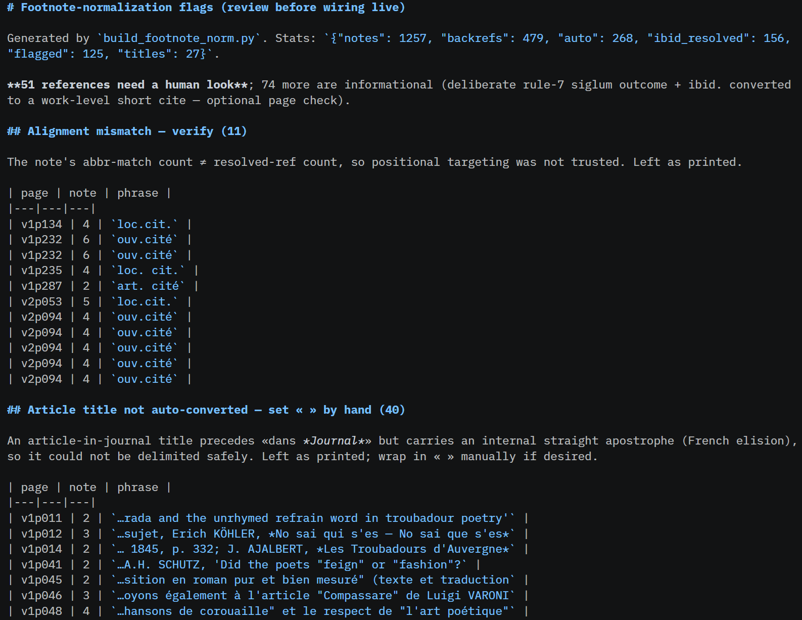
footnote-norm-flags.md, generated by build_footnote_norm.py (see Annex A) in the repository.The reports encode the pipeline's one absolute rule about ambiguity: when unsure, change nothing and say so. A script that cannot resolve a case leaves the printed text in place, which is always a defensible state, and adds the case to a list. The lists are what my checking time is spent on, and they are also, frankly, the part of the project I would most want to see adopted elsewhere. Anyone can claim their AI-assisted edition was "carefully reviewed"; a regenerated file that says 51 cases, here they are is what the claim looks like when it is checkable.
Marks on the reading surface
Two further editorial signals reach the reader directly. The typescript carries handwritten corrections and notes, and they are not my father's: they are in the hands of his best friend, colleague and promotor Raoul Blomme and of Hans-Erich Keller, a professor with whom he corresponded. The edition preserves them and marks each with a small pen sign (✎) where it occurs, because they are part of what this document is: the traces of the thesis's first readers, the scholarly conversation that a never-published work did, after all, have. And readings that remain genuinely doubtful after checking, places where the page supports more than one transcription, are marked with a wavy underline rather than silently settled. Both marks appear in the reading views and the facsimile alike. A reader can go from one of these marks to the scan-level question behind it, which is the whole honesty architecture of the edition compressed into two glyphs: the text tells you where not to trust it.