Raimbaut d'Orange · section 5
The poem as hub
The poem as hub
What paper did to the thesis
A book is one line of pages, and everything a scholarly work is must be threaded onto that line somewhere. The thesis's real structure is not linear at all. At its centre are thirty-nine poems; around each poem hang a French translation, an essay of commentary keyed to individual verses, footnotes, sigla pointing into a bibliography, references pointing back at earlier discussions, and entries in three indexes pointing forward from words, names and works to the pages that treat them. That is a graph, and in 1981 the only way to publish a graph was to serialize it: commentary printed before the poem it discusses, notes at the feet of pages, the bibliography and indexes at the far end of volume 2, photocopies of the source material in volume 3, and every connection between them reduced to a page number the reader must chase by hand.
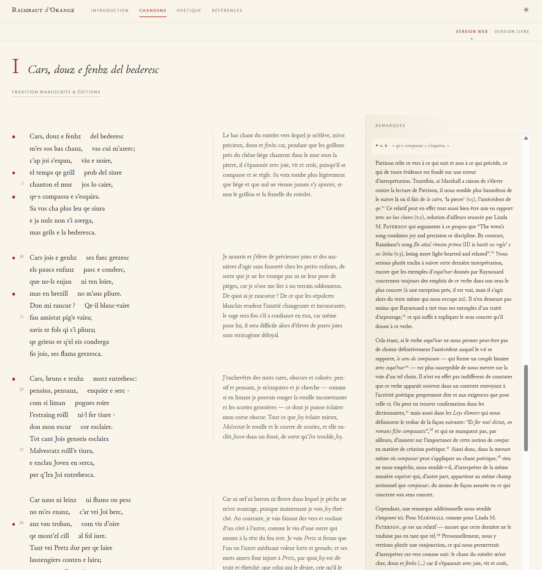
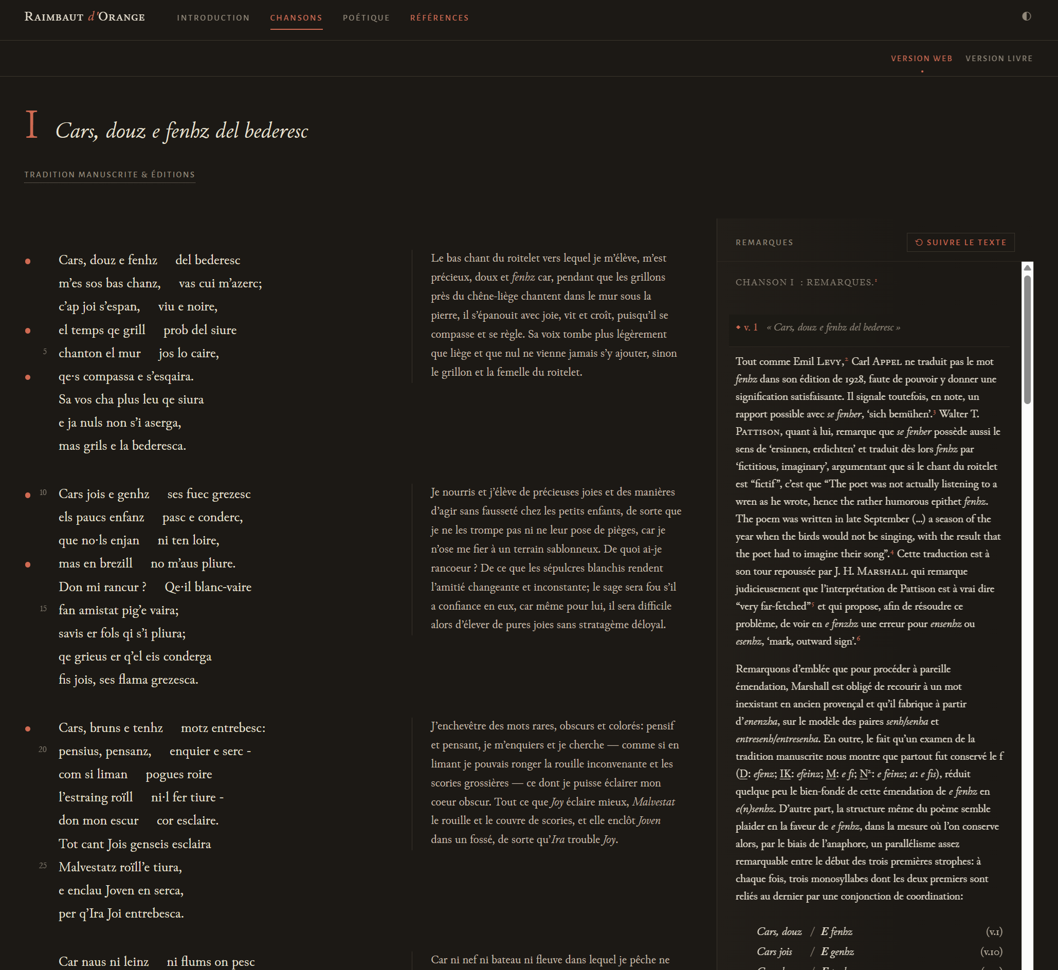
The central design decision of the edition was to undo the serialization
rather than reproduce it. On a chanson page the poem is the fixed point,
and the other layers are brought to it: the translation beside the
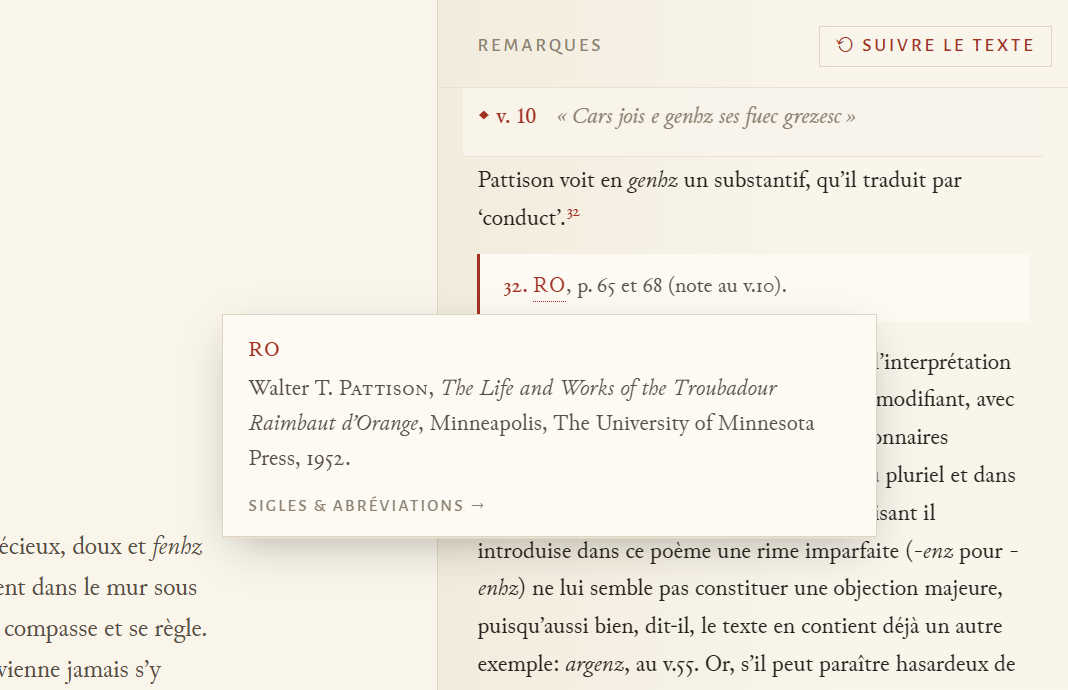
strophes, the commentary anchored to the verses it discusses, the notes
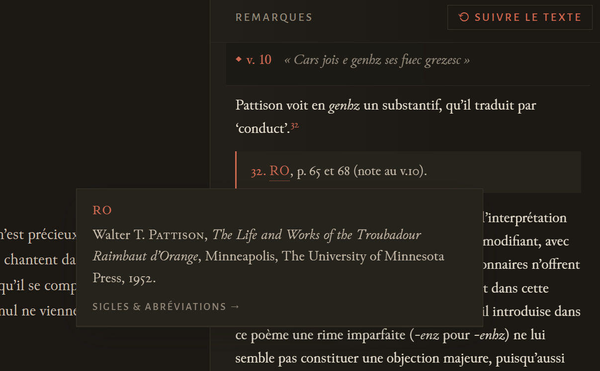
attached to their references, the sigla carrying their definitions with
them, the bibliography reachable from every citation. The thesis supplied
the wiring itself. My father headed his commentary entries with verse
keys, v. 4, vv. 43–45, and those keys form a small, regular grammar
that a script can parse, which means every entry of commentary can be
mechanically tied to the verse or verse range it discusses. Those anchors
carry the whole design; they are what lets a reader stand in the poem and
summon the apparatus, instead of standing in the apparatus and hunting for
the poem.
Designed around readers, not around the print
The design was worked out around the tasks the edition actually has to serve: a student meeting a poem for the first time, who needs the text and translation and nothing else; a scholar asking what the editor says about one particular verse; a medievalist reading the commentary as the continuous argument it is; a reader chasing a citation through sigla and bibliography; and anyone needing to cite the edition against the printed thesis, page for page. Those tasks conflict. The layout that serves the verse-by-verse scholar is actively hostile to the first-time reader, and one compromise layout would have cost every audience something.
How it was worked out is worth recording, because it is the other place
generative AI appears in this project, in a role quite different from
transcription. While the transcription conversation was running, a second
conversation ran in parallel: a design discussion in which I supplied the
intent, the constraints and simple sketches, and two AI systems (a separate
Claude account, deliberately not the one doing the implementation, and
ChatGPT 5.5) drafted, argued and amended proposals against my input. The
repository still contains a document called
UX-PROPOSAL.md
that came out
of that discussion, and it is best read as a relic of the middle of the
process, neither its start nor its end: the result was handed to the
implementing Claude instance and then iterated further in the building,
notably on navigation, the mobile view and the facsimile view.
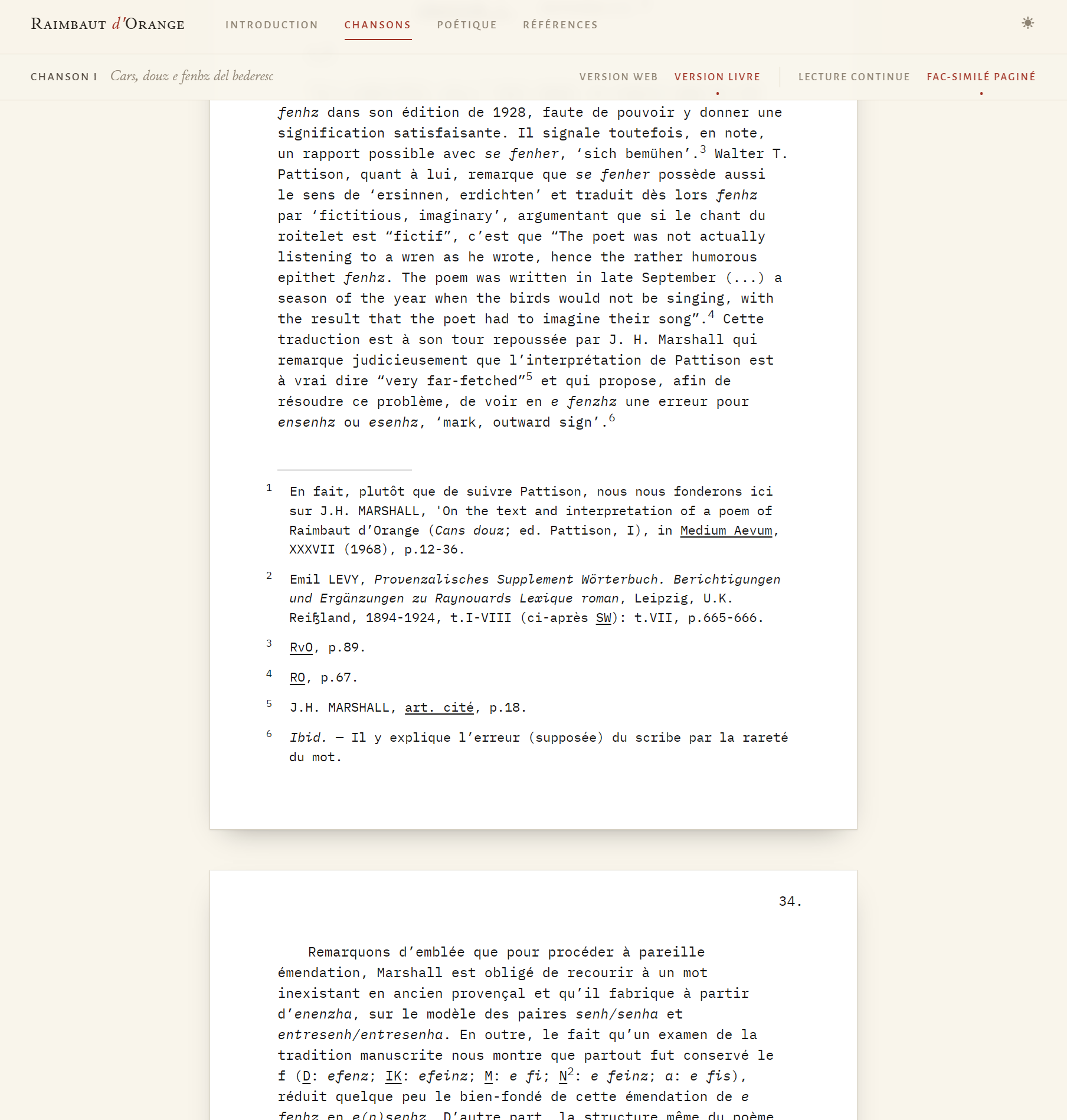
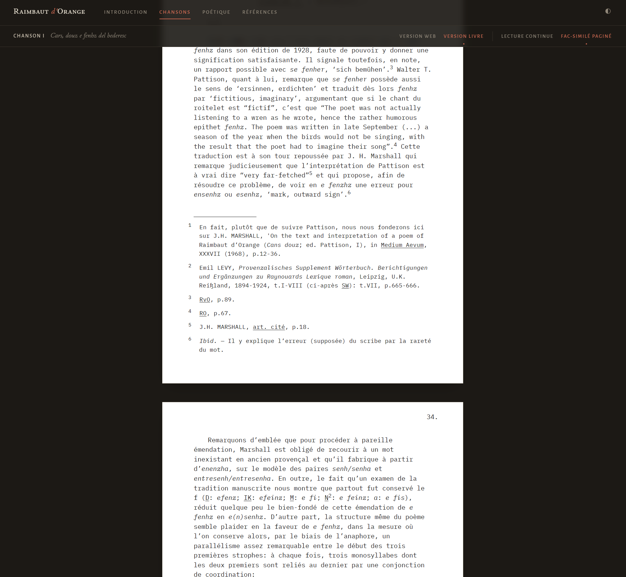
One example makes the iteration concrete. The proposal stage ended with three reading modes: a bare reading view ("Lecture"), a study view ("Étude") with the full apparatus, and a print-like view ("Livre"). Then I decided I wanted a facsimile, which split the print view in two and made the mode switcher too clunky for my taste; that led me to drop the bare reading view entirely and rename what remained "Version web" and "Version livre", the latter with its continuous and facsimile presentations; and then the labels got shortened again for mobile. None of those decisions was in the proposal, and the proposal was still indispensable, in the way a first draft is.
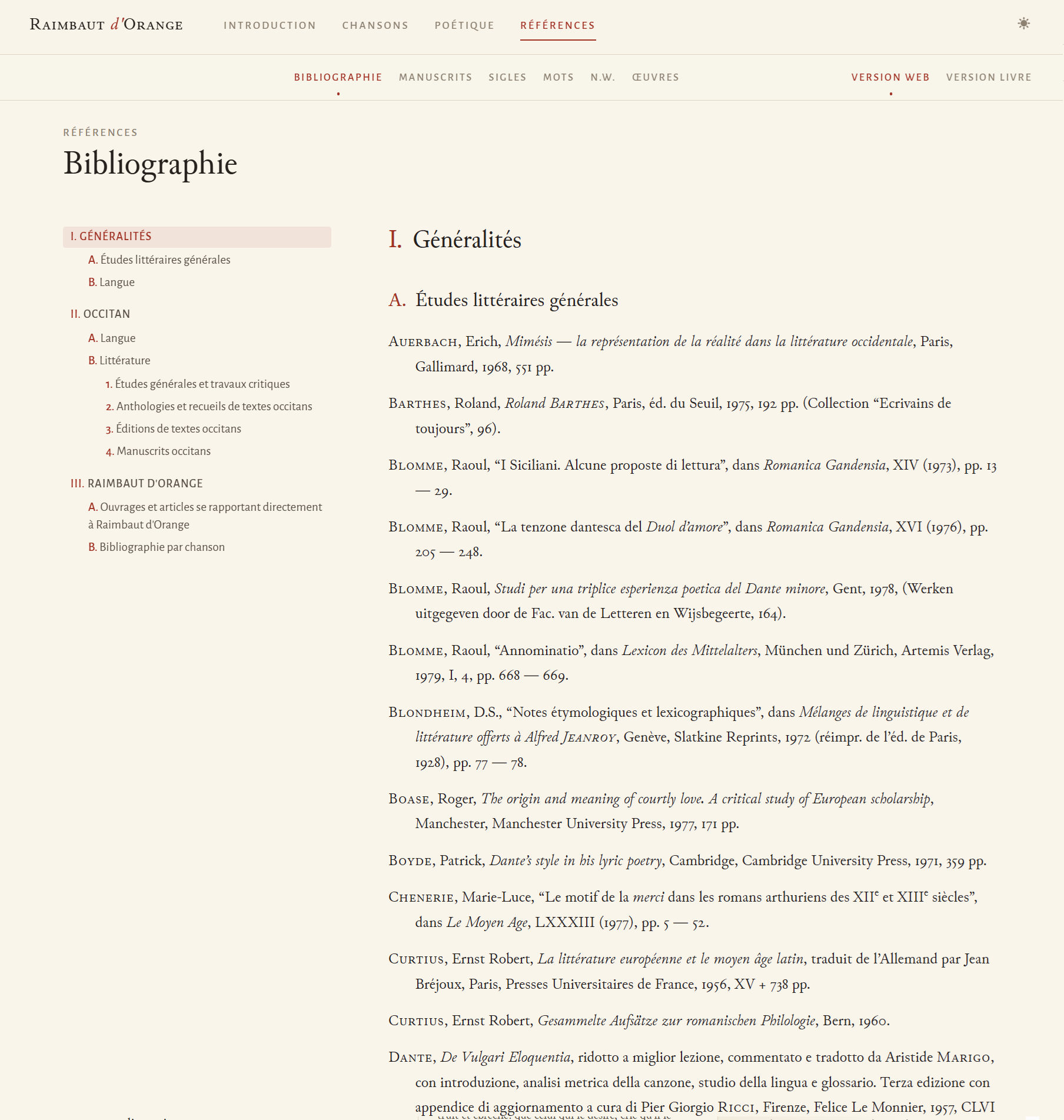
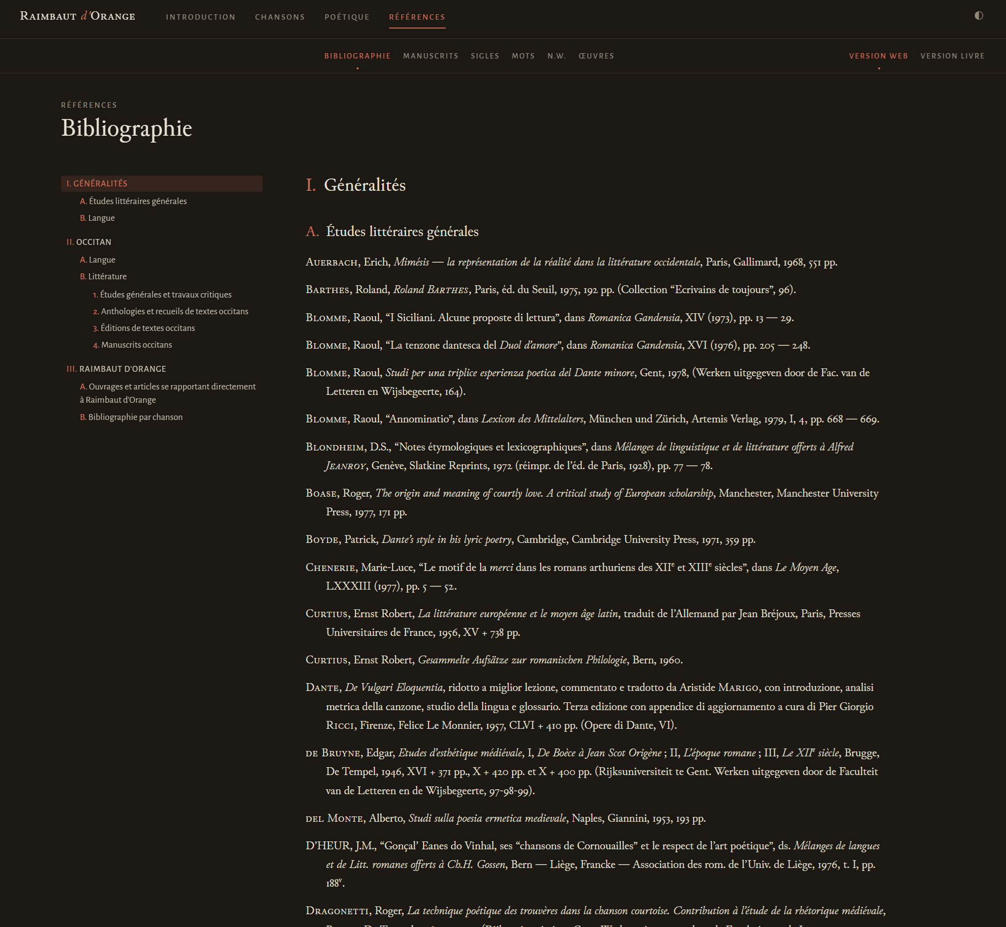
So instead of one compromise layout, the edition switches. Each chanson can be read as the web version, the study view described above, or as the book version, which returns to the typescript's own order and pagination, commentary first, with the notes at the foot of the pages, and which itself offers the continuous normalized reading or the page-for-page facsimile described previously. The choice is remembered from chanson to chanson, so a reader who has decided how they want to read is never asked twice. Around the chansons, the rest of the thesis keeps its linear character deliberately, because introductions and essays are linear: the introduction and the concluding essay on Raimbaut's poetics are chapterized and read in sequence, a pager at the end of each text leads to the next section in reading order, and the keyboard arrow keys do the same. The apparatus pages complete the map: the bibliography with its section hierarchy, the abbreviations table, the table of manuscripts, the three indexes from the thesis (words, names, works — the word index rendered as an interactive concordance), and the colophon.
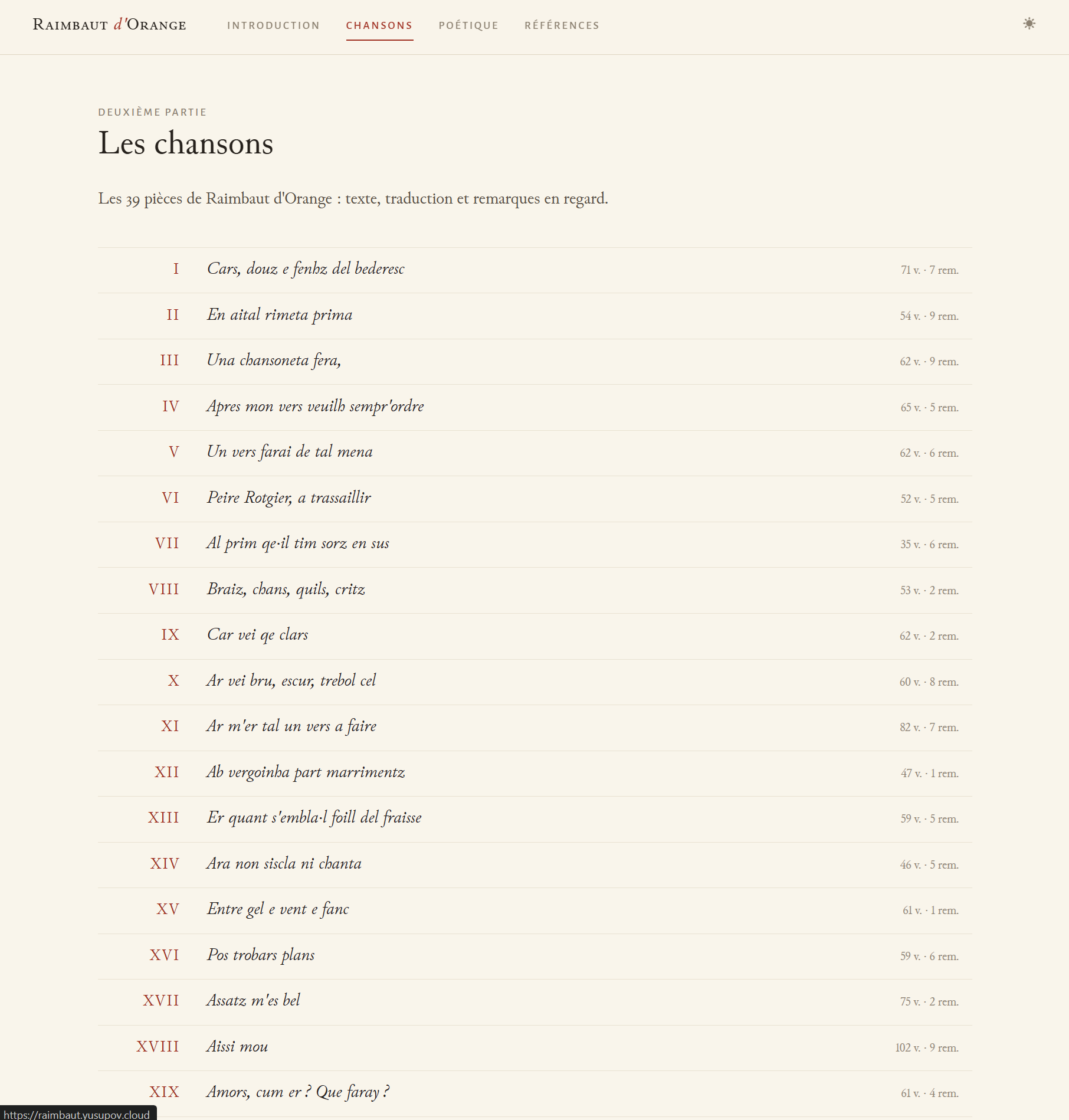
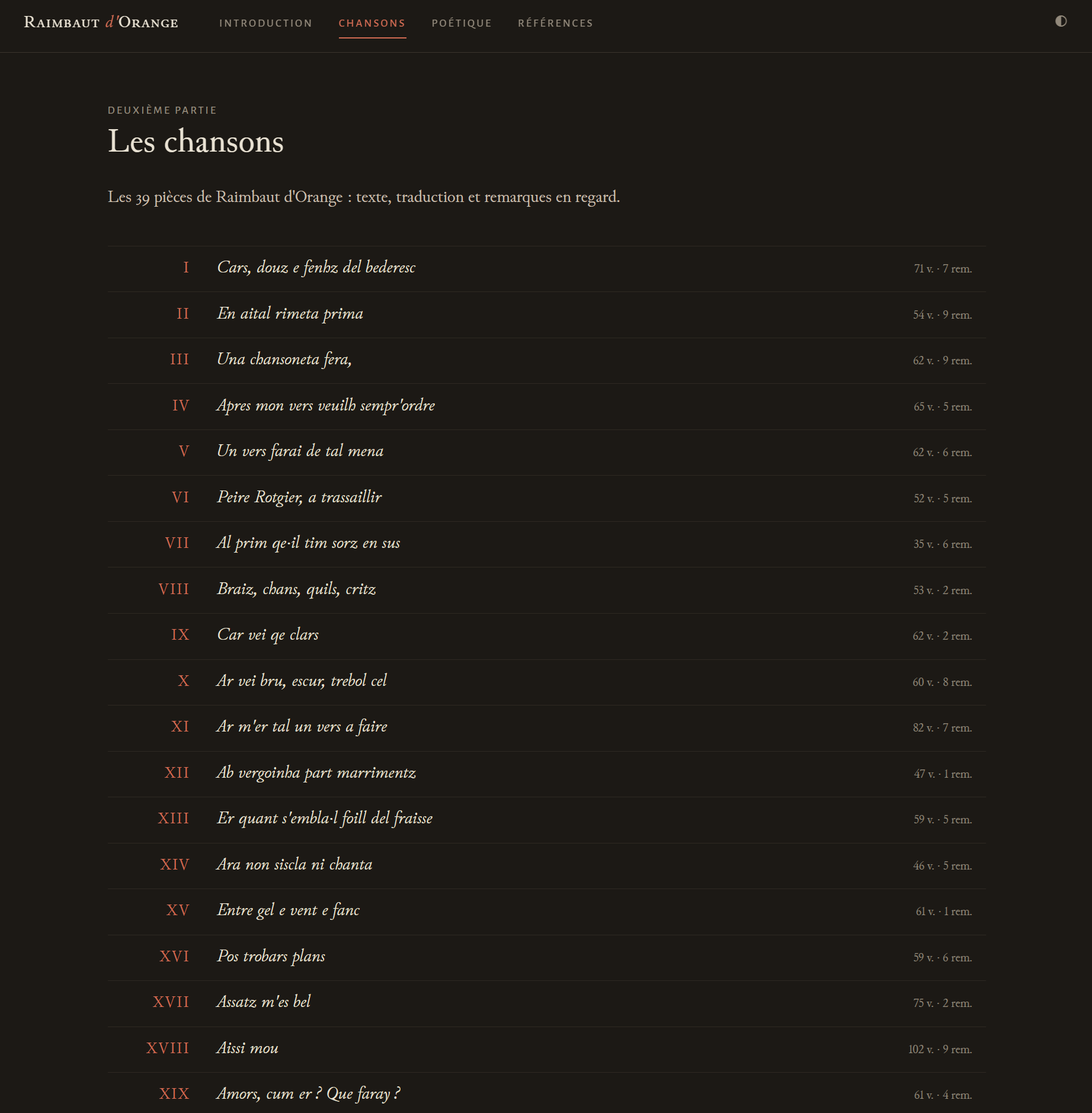
Honesty about method requires an accounting here that has nothing to do with models. This part of the project, the information architecture, the reading modes, the navigation behaviour on a desktop and on a phone, the typographic system, the redrawn figures described previously, was not generated, and it was also not improvised. I have spent twenty-odd years as an information architect and user-centred designer, and the edition's design is that experience applied to one very particular object. The AI systems in the design conversation drafted and challenged; the sketches, the decisions, and the successive rejections described above were mine. I would rather not dwell on this, but leaving it out would distort the record in a way this piece exists to avoid: the two days in which the edition was built are only half the truth about its cost, and anyone planning a similar project without a design background should plan for that difference, whether by keeping the design deliberately simple, by borrowing an existing edition's patterns, or by working with someone who does this for a living. The transcription is the part that became cheap. The design of a readable edition did not.
The build, in accessible terms
The technical expression of all this is deliberately modest, and the principles matter more than the tools. The published edition is a static site: a folder of ordinary HTML files, generated in advance, with no database, no server-side program, and no third-party services. What the reader's browser downloads is the finished text, not an application that fetches the text. JavaScript exists on the pages but only for comfort (the version toggle, note synchronization, the keyboard shortcuts), and with it switched off every page remains complete and correctly ordered. There is no tracking of any kind.
The generator is Eleventy, which turns the corpus
and the seven derived data files into those HTML pages at build time. One
data module reads everything in and shapes it; the templates then produce
each page; a handful of build-time JavaScript modules do the apparatus
rendering, the footnote gating, the hovercards, the concordance. The
Markdown dialect is standard markdown-it with two small extensions that
allow attributes and bracketed spans, and this is why the corpus
conventions look the way they do: [RO]{.underline} and ::: {lang=oc}
are not a private notation but ordinary syntax for that toolchain, which
means the corpus is renderable by widely used software rather than by
something bespoke that will need maintaining.
The typography is the one place the build indulges itself, and it does so for a reason given in the edition's own colophon: the text face is Peter S. Baker's Junicode, a typeface designed for medievalists after the seventeenth-century Oxford types, and the interface face is Juan Pablo del Peral's Alegreya Sans; both are free, and both are served from the site itself rather than from a font service. A medieval-studies text set in a medievalist's typeface, with no request leaving the page: the aesthetic choice and the preservation choice turn out to be the same choice.
Why static, as a preservation matter, deserves its own plain paragraph. Every dynamic system in a website is a promise somebody must keep: databases must be migrated, server software patched, dependencies renewed, accounts maintained. A folder of HTML files makes almost no promises. Any web server ever written can host it, a copy of the folder is a complete backup of the edition, and a reader in twenty years with a browser and the folder needs nothing else. For an edition whose whole purpose is to stop a work from disappearing again, minimizing the number of promises was requirement one rather than an implementation detail. The stack details, the commands, and the data shapes are in Annex A for anyone who wants to build the same way.