Built in a day · section 5
The polish
The polish
🖼️ Covers: Three Roads to One Image
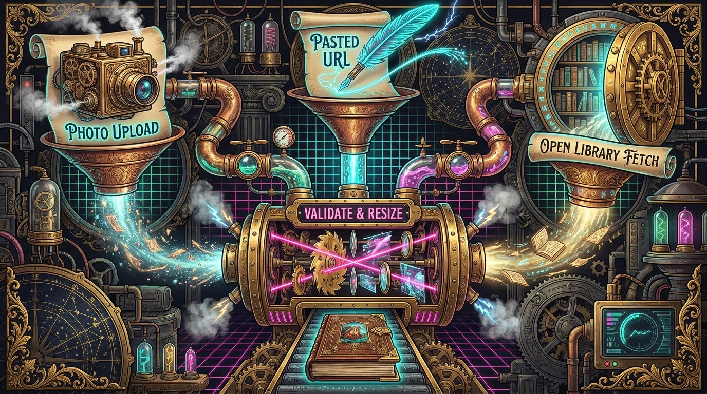
Let's be honest: a booklog without covers is a spreadsheet. Phase 4 opened three roads to getting a cover onto a book, from both the edit form and the add-flow proposal cards: upload a photo from the phone, paste an image URL, or tap "Zoek op Open Library" and choose from tappable candidate thumbnails. Three roads. One destination. Zero excuses.
Whichever road the image takes, it arrives at the same border checkpoint.
The server validates every cover with Pillow — only formats the site's own
build can decode are allowed through, honouring the site's existing format
guard — downscales anything wider than 1200 pixels to a JPEG, and files it
under the site's media/wp-content/uploads/YYYY/MM/ convention, year and
month taken from the post's date. Crucially, the image and the front-matter
change travel in the same commit — and if the lint or the push fails, the
rollback removes (or restores) the image too. A cover can never be
orphaned, and a post can never point at a cover that didn't make it. Is
that level of transactional care strictly necessary for a booklog?
Probably not. Is it deeply satisfying? Absolutely.
Both roads were verified in the dev clone: an Open Library URL replacing an existing cover produced a single-file binary diff with the front matter untouched (the path is stable, so nothing else needs to change), and a fake 1600×2400 "phone photo" came out as a tidy 1200×1800 JPEG.
Feedback round three then sharpened the Open Library road with a quality floor: the metadata endpoint reports each candidate's dimensions, so anything under 1000 pixels on either side is dropped — checked in parallel — and the surviving thumbnails display their sizes. The honest consequence is stated as designed: a book whose only available covers are small now returns few or no candidates rather than junk. Fewer options, better options. Quality over quantity, every time.
📱 The App That Isn't in an App Store
A web app becomes a phone app the moment it earns a place on the home screen, and phase 4 delivered the credentials: a PWA manifest, standalone display, theme colours matching the header, and proper icons. No app store. No review process. No 30% commission. Just the open web, doing what the open web does best.
The icons themselves went through two generations in a single day — a miniature design story. The first generation was drawn programmatically: a bookshelf of spines in the site's palette, rendered with Pillow, no font dependencies. Perfectly serviceable. But the follow-up request was better: use the site's own icon. The booklog's favicon is a piece of pixel art — an open book on an 18×15 grid — and the final PWA icons rasterize that SVG with nearest-neighbour scaling onto the app's dark header colour, sized to sit inside the maskable safe zone, so the pixel art stays crisp at 192 and 512 pixels. The app now carries the site's face, not a lookalike. Small detail. Big difference.
And because a git-powered app should never leave you wondering whether your push actually became a website, the topbar gained a deploy indicator: a small element that polls the GitHub Actions status of the site's repository — "deploy…" while a run is queued or running, then a quiet "✓" or a "deploy faalde", linking to the run. One wrinkle: the site's repository turned out to be private, so the indicator needs a fine-grained personal access token with read access to Actions; without one, it renders nothing rather than erroring. Graceful degradation isn't a slogan. It's a default.
🔴 The Very Red Badge
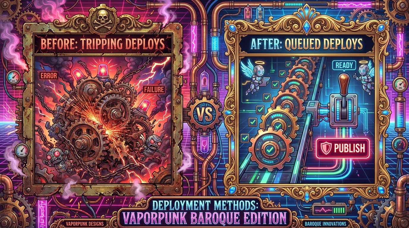
Here's the kicker: the best feature of the entire app arrived, fittingly, as a response to a failure. Feedback round three reported that a burst of quick consecutive edits had caused the site's Actions runs to cancel each other — "Canceling since a higher priority waiting request for deploy-production exists" — because every save pushed immediately, and the site's deploy pipeline treats rapid-fire pushes as newer-wins.
The fix reframed the whole workflow: publishing became an explicit act.
Saves still pull, lint and commit — every edit stays atomic and reversible
— but nothing pushes automatically anymore. Instead, the topbar counts the
queued commits and shows the number in a red circular badge, white on red,
22 pixels across. Tap the badge and it becomes a rounded red button:
"Publiceer 3". One tap, one push, one deploy — however many edits were
queued. The burst of pushes is gone at the source, and the dev-mode
GIT_PUSH switch found its true calling: it now gates the publish button
itself, so a development box physically cannot deploy. A failure became a
feature. That's not spin — that's iteration working exactly as intended.
The same round fixed a bug that had been latent since phase 1: cover images were hotlinked from the live site, which was invisible right up until the app started creating covers — a freshly added cover 404'd until the deploy finished. Covers now serve from the app's own clone, login-gated, so a just-committed cover shows immediately. The lesson is a classic: a latent bug waits, patiently, for the feature that makes it visible.
🏷️ Death by a Thousand Labels
One last polish story, because it carries the day's best CSS lesson. A
phone screenshot showed the category checkboxes still rendering wrong —
after they had already been "fixed" once. The root cause was archaeology of
a different kind: the login form's generic .form-group label rule sat
later in the stylesheet and silently overrode the category grid everywhere.
The earlier fix had never actually applied. Scoping the login styles to the
login form ended it. One selector. One fix. Done.
The restyle that followed turned the categories into proper toggle buttons
— checkbox visually hidden, the label is the button, the checked state
carried by :has(input:checked) — and unified the app's whole button
language: progress-mode pills, action chips, all understated, all
consistent. Verified by computed styles and by tapping, in the mobile
viewport this time. Because the enduring lesson of the day was already
written in the log: the phone screenshot caught what desktop spot-checks
had missed twice. Generic element selectors leak. Scope your styles, and
test on the device you actually built the app for. Always.
One page remains: the lessons, the numbers, the FAQ, and what comes next.