Your website is almost here! · section 4
The evening
The evening
The emergency ended before dinner, and I could continue working my real job without worrying about the site. Everything I did after the work day ended was fun.
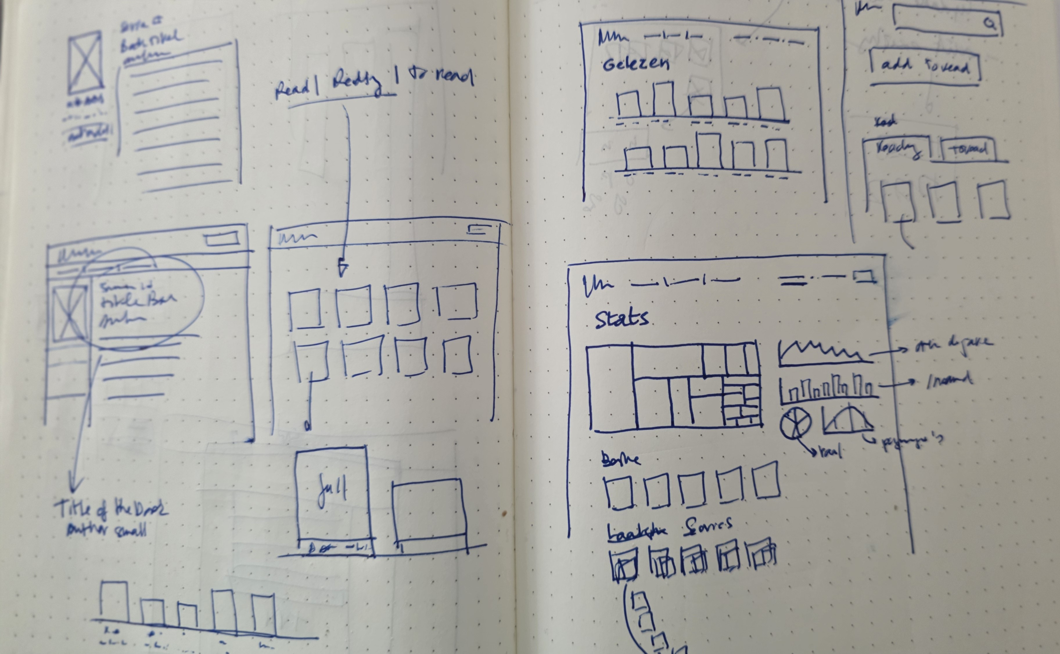
The strangler-fig discipline — first reproduce exactly, then improve — has a reward built into it, which is that once parity is banked, improvement is free. I no longer had to weigh any change against "but then I'd have to dig into the old theme", the clause that had killed every redesign impulse for a decade, because the old theme was no longer load-bearing. It went in the bin that same evening: the actual WordPress theme was gone since the morning, but I also dropped every single trace of html and css I had around the content. I was not about to refactor it. The new front end is greenfield, written from scratch against clean Markdown content, it took most of the evening and a decent slice of the night, and it contained (at least in utero) more or less every small idea I had been quietly filing away for years under someday. Some of those ideas had made it as far as a notebook: shelf views for read, reading and to read; a cover-led book page; search; and a rather hopeful statistics screen.
Shelves, not a blog
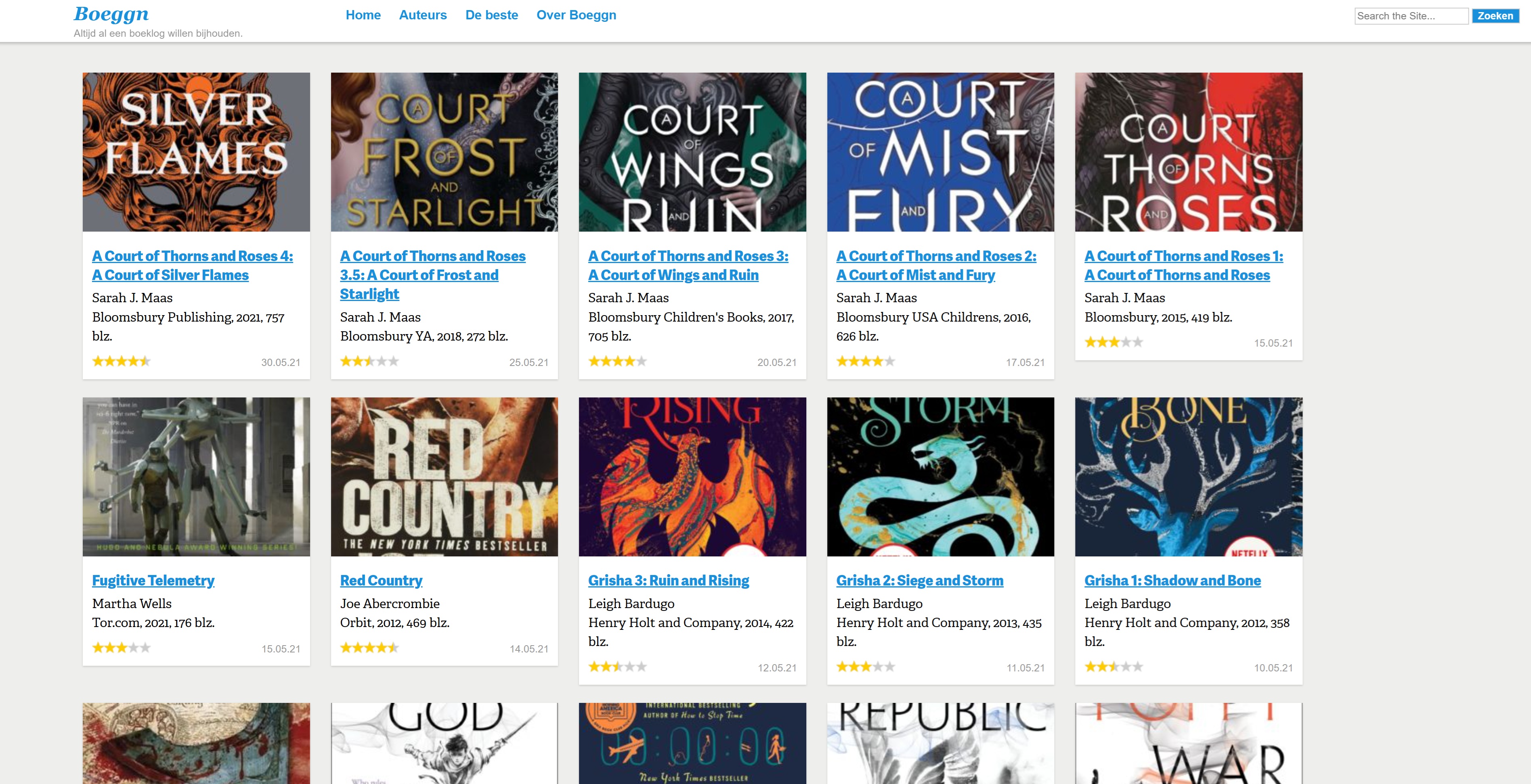
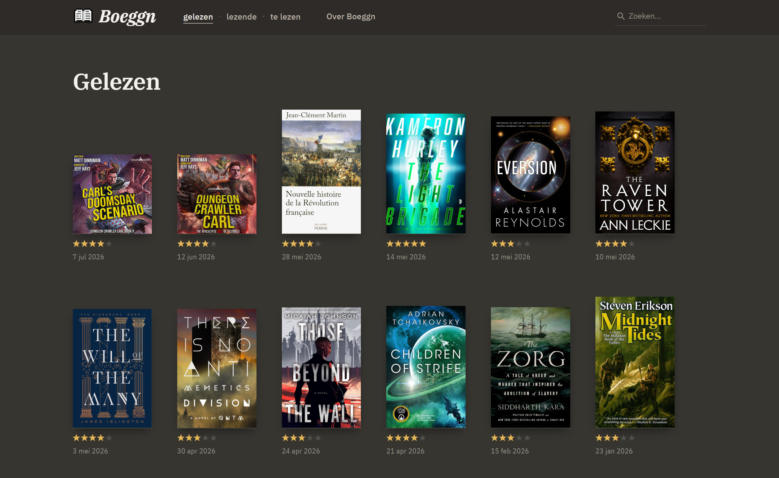
The old site was shaped like what it ran on: a blog. Reverse-chronological posts, paginated — forty-five pages deep by the end. There wasn't much incredibly wrong with the old home page, but a booklog is not really a diary; it's a library. The old home page had a card view with cropped covers. The new home page is a straight bookshelf, bottom-aligned and unapologetic about divergent aspect ratios. The reading states became first-class shelves — gelezen (read), lezende (currently reading, with a progress gauge), te lezen (the to-read pile, a category of book I pretend to be at peace with) — instead of the old arrangement, where "currently reading" was, of course, a (mostly unused) category, because when all you have is a taxonomy, everything looks like a term.
Typography: IBM Plex. I like IBM Plex. Self-hosted, serif for reading and mono for the
chrome; a dark theme as the default, and I'm not even sure whether I'll ever have a light theme. The
review texts themselves got hauled out of fossilized WordPress HTML — shortcodes,
Gutenberg <!-- wp:paragraph --> nonsense, straight quotes — into clean Markdown with
curly quotes, proper em dashes, and the occasional centred ⁂, which is the
kind of detail nobody will ever consciously notice and I continue to enjoy every
single day.
Every book gets its own room
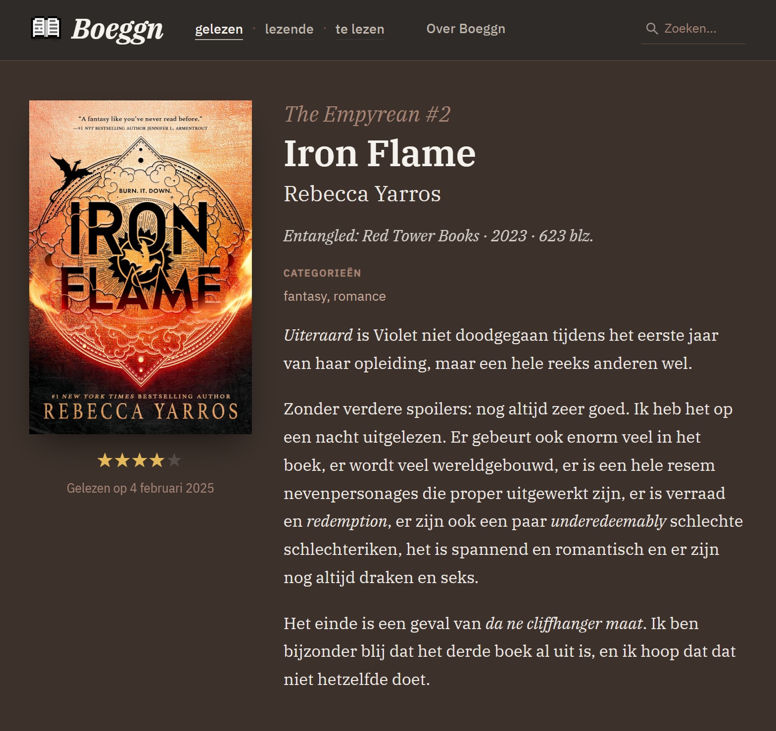
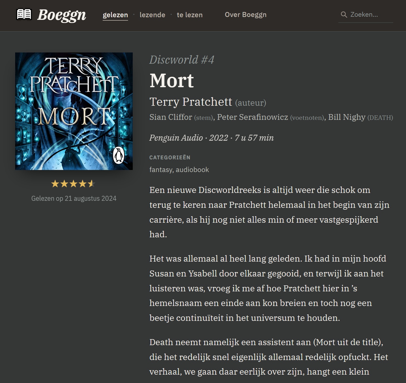
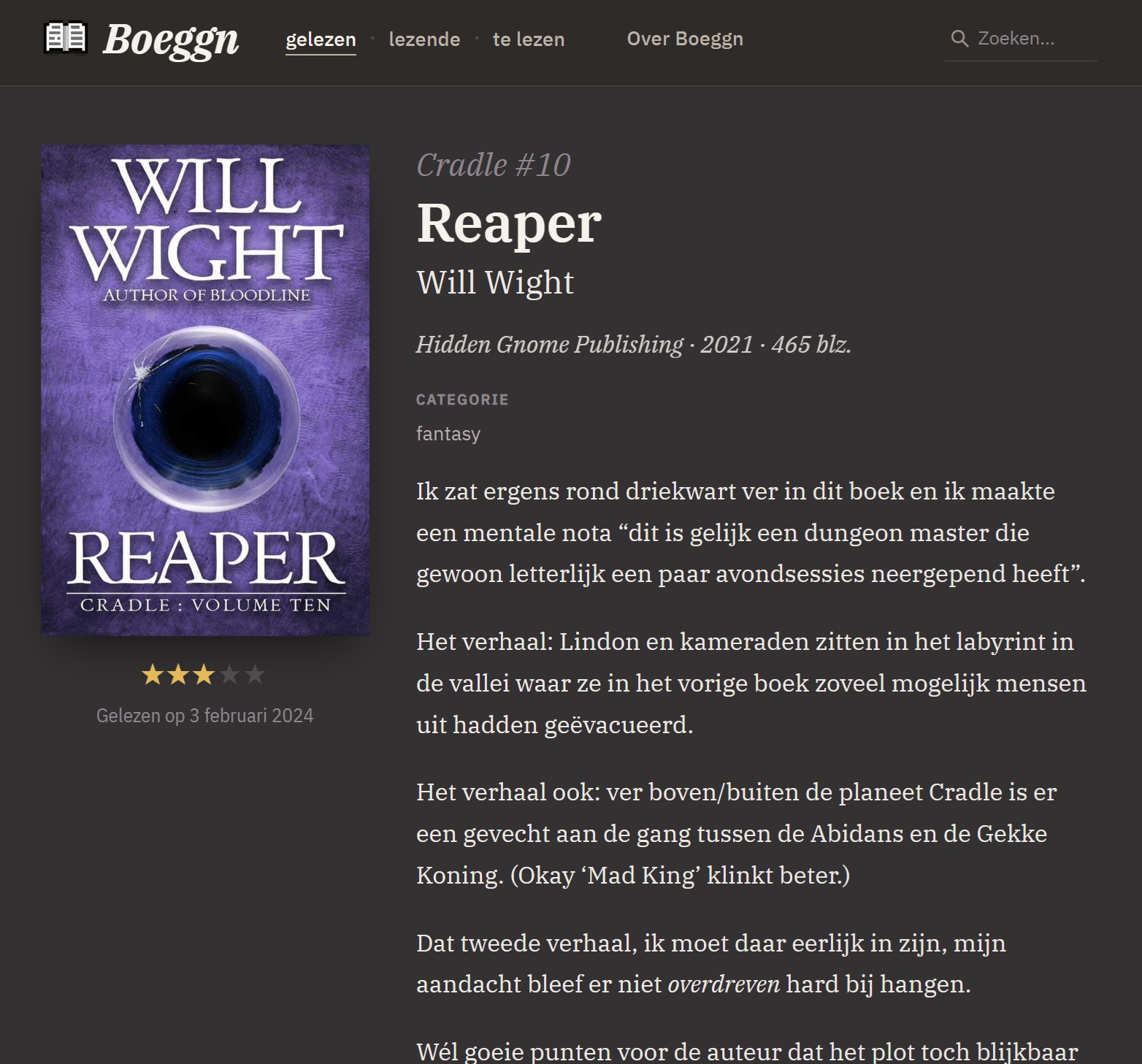
The very subtle detail I am most pleased with: each book's page takes its colour from the book's cover. The dominant colour is extracted from the cover image and becomes an accent that tints the page — background, surfaces, rules, the metadata text — so that the page for different books feel like different rooms in the same house.
The trick is doing that without ever letting a cover break the page. The raw cover colour is first darkened toward near-black, and the page surfaces mix toward that — so a pale or garish cover can tint the chrome but can never lighten it, and the dark theme stays dark. Body text never mixes at all, and the header keeps fixed colours outright, so navigation contrast stays at WCAG-AA whatever the cover throws at it. The core of it is a few lines of modern CSS:
/* --cover-deep: the cover hue darkened toward near-black. Surfaces mix
   toward *this*, not the raw cover — a pale cover can tint the chrome
   but can never lighten it. Plain values are the pre-color-mix fallback. */
--cover-deep:#241f18; --cover-deep:color-mix(in oklab, var(--cover) 60%, #17130d);

--bg:#3b3734;      --bg:color-mix(in oklab, var(--base-bg)      86%, var(--cover-deep));
--surface:#454039; --surface:color-mix(in oklab, var(--base-surface) 84%, var(--cover-deep));
--meta:#a99b8c;    --meta:color-mix(in oklab, var(--base-meta)    80%, var(--cover));
I know this is nothing earth-shattering — I think Netflix does or did the same — but it's something I'd not done before and always wanted to do. I was fully prepared to put a lot of work into this (or rather have AI put in the work, obviously), but it turns out Hugo has exactly the necessary tools to do exactly this for exactly the same reason I wanted it — the kind of attention to details that warms the cockles my heart, like when I discovered pluralise in Python.
Smaller pleasures
One line each, because each could be a paragraph and shouldn't: series became a real taxonomy (277 books across 68 series, with a sort key that lets an omnibus live at position 4.5, between 4 and 5, where it belongs); covers became first-class citizens instead of "featured images"; the Amazon affiliate links went where the plugins went.
Deliberately not on this list: the bibliography and author data, the
free-text publicatie field the archaeology section warned about. That
refactor was not an evening's work, was not entirely the machine's work
either, and gets the next section to itself.